post

NAHB Criticizes Move to Raise Canadian Lumber Tariffs

WASHINGTON, DC — The National Association of Home Builders has sharply criticized a decision by the Biden Administration to double the tariffs on Canadian lumber shipments into the U.S., charging that the move would “exacerbate market volatility, put upward pressure on lumber prices and make housing more expensive.”

Chuck Fowke, chairman of the Washington, DC-based NAHB, charged that the recent decision by the U.S. Commerce Dept. to proceed with an administrative review to increase the tariffs on Canadian lumber shipments from 9% to 17.9% would be counterproductive to a housing market that is already facing considerable challenges to future growth.

“With the nation in the midst of a housing affordability crisis … this is the worst time to add needless housing costs onto the backs of hardworking American families, Fowke said. “Home builders are grappling with lumber and other building material supply chain bottlenecks that are raising construction costs. And consumers are dealing with rising inflation that is pushing mortgage interest rates higher.

“The White House needs to change course and move immediately to engage with our Canadian partners on a long-term solution to the trade dispute that will end tariffs and help restore price stability to the lumber market.”


The post NAHB Criticizes Move to Raise Canadian Lumber Tariffs appeared first on Kitchen & Bath Design News.

Did you miss our previous article…
https://www.denniskitchens.net/?p=767

post

Natural Warmth

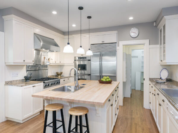
The kitchen is the command center of many homes, with countertops called upon to handle more and more tasks. Food preparation is just the start; surfaces in the kitchen are also used for work, school, pet care and much more. These myriad uses require countertops that are strong and easy to care for. And, because they are so prominent in the kitchen, these surfaces must also look great and complement the other elements in the space.

“Consumers want products that are easy to maintain, durable and able to sustain a very active lifestyle,” says Massimo Ballucchi, v.p. kitchen and bath business at Cosentino North America, based in Coral Gables, FL. Customers are upgrading their countertops for aesthetic reasons as well, he says. “They want products that are making their homes a showcase…products they can admire for a long time.”

Colors and finishes for surfaces vary greatly based on individual style and taste, but there’s a clear move towards incorporating natural elements. “Designs and materials that are inspired by nature continue to lead the way in home decor trends,” stresses Gwen Petter, director of design for Temple, TX-based Wilsonart. “We’re seeing it everywhere from décor and paint colors to textiles and building materials, including countertops. Research shows that nature can offer mental health benefits including decreasing stress and relieving anxiety, as well as improve happiness and well-being.”

Material choice is often driven by convenient maintenance. “With a wave of new home buyers, we’re still seeing many homeowners unaware of the varying levels of durability and maintenance required when it comes to their countertop choices, and they’re shocked when they realize the maintenance involved with many popular options, such as marble,” offers Gerri Chmiel, residential design lead at Formica Corporation in Cincinnati, OH. “Interior designers say homeowners most often ask for the look of marble or quartz, but also want durable surfaces that are easy to clean and maintain,” she adds.

This is leading designers to recommend products that are low maintenance yet don’t compromise on modern, beautiful design. Colors that add warmth to the space – along with bolder colors, textures and materials that help make a statement – are also currently trending. That’s according to manufacturers recently surveyed by Kitchen & Bath Design News.

Natural Look Without the Wear

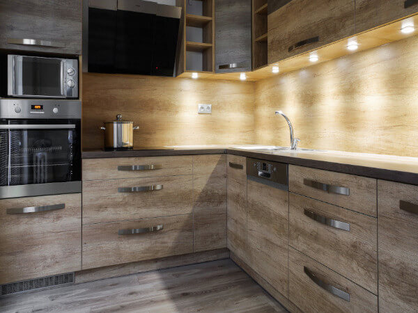
An organic, natural feel is desirable, but that doesn’t mean consumers are necessarily choosing natural stone. Maintenance concerns are driving the need for products that have the look of natural stone while offering higher durability. This has created a shift towards quartz, porcelain, laminate and solid surface.

“Consumers are most interested in performance, in-style yet timeless looks and materials that offer solutions,” Petter remarks. “The serene beauty of quartz is always in high demand, and it’s no surprise when you consider the material’s many benefits: on-trend elegant designs for any space, easy to clean and maintain, durable, stain resistant.”

“Solid Surface is quickly gaining traction as one of the most sought-
after countertops for its reliable durability, impact resistance and nearly effortless maintenance,” she adds.

The tendency of natural stone to stain and etch has driven the market towards porcelain, which offers the look, feel and depth of natural stone without the maintenance concerns, says Michael Zeitlin, executive director of Raphael Porcelain in Lodi, NJ. “Zero maintenance is something that every homeowner dreams of having when going for that look,” he states.

Maggie Ellis, residential marketing leader at Corian Design, based in Wilmington, DE, says they see users gravitating towards stone-like aesthetics as well as industrial looks such as cements and ironstone. “It really depends on the consumer, how they use their space and their personal style. In general, natural patterns are in demand,” she reports.

Practical Matters

Kitchen surfaces need to stand up to a wide range of activities, especially with the overlap between home, school and work these days. Durability, easy maintenance and cleanliness concerns have had a great impact on countertop trends, manufacturers say.

“Worry-free is a prerequisite to any surfacing in today’s world – whether it be flooring or countertop. That demand is here to stay,” stresses Sam Kim, senior v.p. – product at MSI in Orange, CA.

“Materials in homes need to be durable, to withstand the increased wear and tear and more frequent cleaning,” notes Ellis. Because outdoor spaces are being used more often, she adds, materials such as high-performance porcelain that can stand up to UV rays and the elements are in demand.

“We’ve seen a remarkable shift in consumer priorities to include a new focus on cleanliness and therefore countertop surfaces that can stand up to this new cleaning routine the world has taken on,” Petter states. “Materials that offer antimicrobial protection and stand up to rigorous cleaning are in high demand as we continue into this new normal.”

“Quartz, in general, has always been a durable and low-maintenance option for countertops,” adds Ed Rogers, executive v.p., US Surfaces, for Austin, TX-based Vadara Quartz Surfaces. “We are always looking for ways to improve our materials, and I believe consumers now are becoming more educated before they ever leave the house as to the type of product they want and how they need to take care of it.”

Bernadette White, v.p. at Cancos Tile + Stone in Southampton, NY says that, along with durability, the fact that porcelain comes in multiple thicknesses – allowing for a backsplash in a thinner material and thicker countertop while still book matching veining patterns – makes it a popular choice.

Warming Up

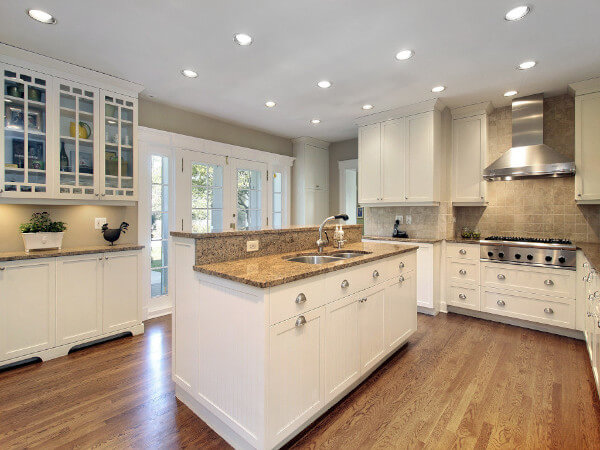
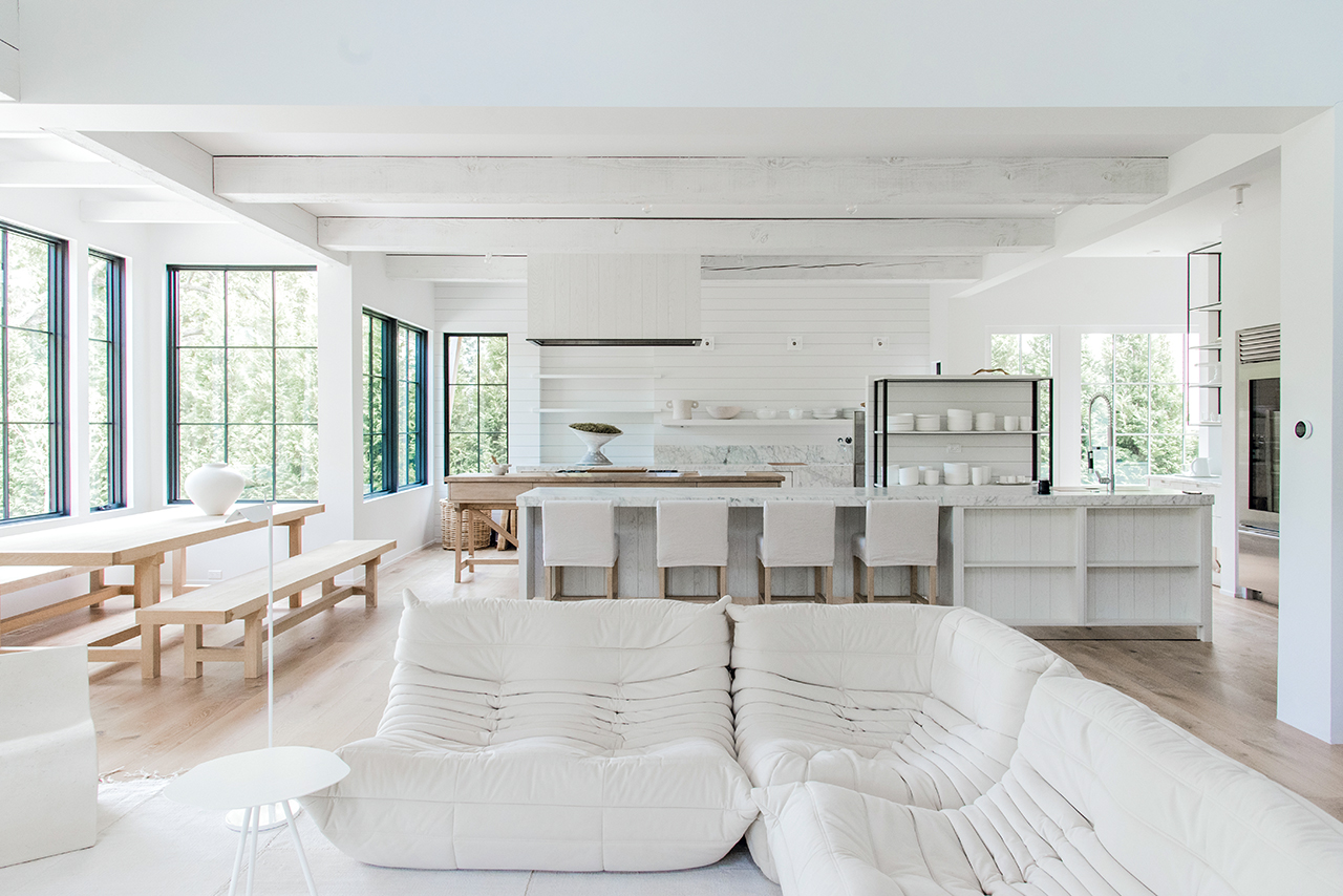
Manufacturers note that white is still the most prominent color for kitchen countertops, but warmer tones with texture and character, rather than stark, bright whites, are on the rise.

“Homeowners are looking for simple, grounding spaces that bring a sense of calm, so we’re seeing light, white spaces continue to dominate,” observes Chmiel. “People are comforted by what’s familiar, yet they’re craving something fresh and don’t want white to feel too stark, so we’re seeing an infusion of color into traditional palettes with an added hint of texture and drama.”

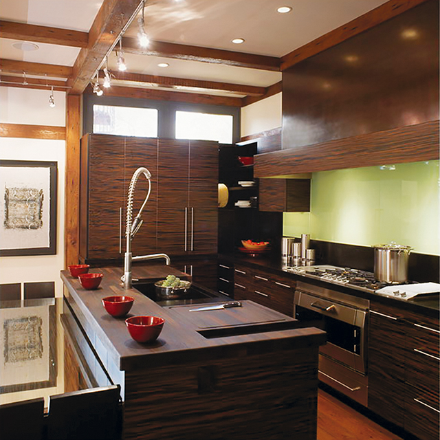
Ballucchi says the most sought-after trend right now is a white countertop with veining. “It showcases a clean look and the veins bring us back to a connection with nature and the everlasting richness of marble,” he explains.

The kitchen countertop is still dominated by white marble colors, concurs Taewoo Kim, surface product design director at LX Hausys America, in Atlanta, GA. “With a white base tone, gray, gold, navy and green vein colors that go well with the cabinet color are predominant,” he adds.

“While we see warm tones increasing in demand, the majority of the market is still demanding a lighter/white design aesthetic,” offers Jason Brown, director of Product Management for Architectural Surfaces, based in Austin, TX. He says veined marble porcelains, especially those emulating natural marble patterns, are seeing a surge.

Sam Kim remarks, “Warmer tones of both background and vein colors are gaining popularity, as are alternative finishes, such as MSI’s concrete- finish in quartz, which features the feel of concrete without any of the maintenance, staining, fingerprints, etc.”

Ballucchi adds that there’s a trend toward soft grays with beige undertones, sometimes known as “greige.” These colors add a contemporary feel, he notes, but can also go well with traditional cabinetry. Adding the beige to colder gray warms it up, bringing a more organic feel, he adds.

Bold Colors and Textured Looks

Homeowners seeking to make a statement are often moving towards darker or more vibrant colors, often mixed with other materials to add contrast, manufacturers say.

“Consumers are more open to adding color to their countertops,” Ballucchi notes. “Just as blues and greens are getting stronger in cabinetry, equally saturated, solid hues are also being sought out in countertops, as seen in Silestone’s newly-launched Sunlit Days Collection.”

Brown agrees that colors are currently in demand. “We’ve also seen an increase in bold and vibrant colors in residential settings for countertop designs – bold bathrooms, for example. People like a statement piece. We’re also seeing statement pieces on the kitchen island, while the rest of the kitchen is a calmer color/design,” he notes.

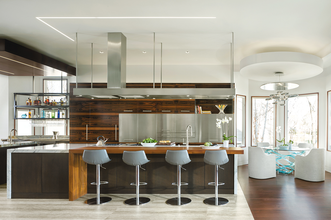
Mixing materials helps create visual interest while also maintaining practicality. “We are seeing an increased interest in mixing and matching materials to maximize functionality and beauty,” Ellis reports. “For example, in the kitchen, some homeowners are using Corian Quartz for the island and Corian Solid Surface for the perimeter, and 100% natural Corian Endura porcelain for the backsplash.” Homeowners are also experimenting with texture, she adds.   

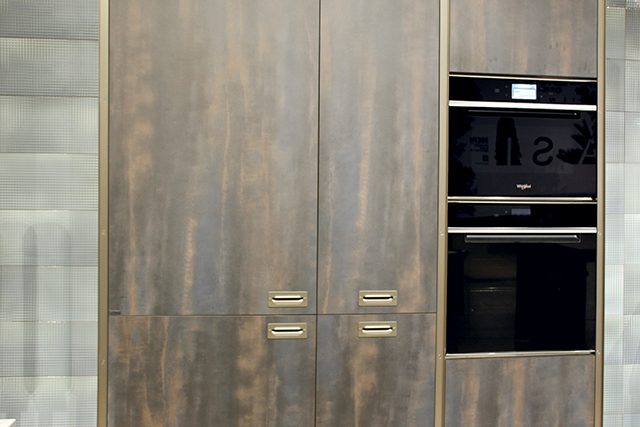
“With color and patterns, we’re seeing continued emphasis on calming light colors and a twist on classic patterns,” says Chmiel. “When it comes to texture, there’s an increased interest in natural finishes that further contribute to a grounded space. Expect to see a greater emphasis on woodgrains and metals that develop a patina over time.”

“The feeling of concrete emphasizing modernity is attracting attention around the city,” adds Taewoo Kim. “Concrete, which has a rough feel as if it has been painted white, different from the existing marble texture, is increasingly attracting attention from consumers who are looking for a stylish kitchen.”

Rogers believes that color selection is dependent on the individual homeowner’s tastes and preferences, and whether they want a monochromatic look or interesting movement. “Book-matched patterns are very popular, particularly for consumers with larger island workspaces and seating areas,” he said. There is also movement to develop different textures, he adds. “For us, specifically, more diverse/complex backgrounds using a combination of colors and veining techniques add depth to the material – making it look as natural as possible.”

On the Edge

Edge treatments may not be the top consideration when choosing countertops, but they must be part of the conversation, manufacturers note. “It is commonly said that the edge gives character to the project,” says Ballucchi. “Although the choice is based on personal taste, some edges do complement certain kitchen looks better than others.”

Zeitlin notes that, even in residential treatments, waterfall edges and full backsplashes made from the same material as the countertop are being used more often to give the space a cleaner, more luxurious look.

White reports that clients are wanting multiple built-up edges in the kitchen – such as 5cm thickness on the island and 2cm thickness on the countertops.

Brown offers, “Eased edge or flat polish is predominantly the edge of choice. Mitred waterfall counters are also trending now.”

Clean lines rather than bulky, ornate edges are in demand, according to Rogers. Waterfall edges on islands and full height backsplashes to match the countertops are also popular, he adds.

Functional upgrades

The longer people remain at home due to COVID-19, the more concerned they become with ensuring that the space works for them. “There has been a surge in demand for home renovation, as people are spending more time at home and want their space to be both functional and beautiful,” Ellis reports. “We will likely continue to see interest in materials that are highly functional, sustainable and beautiful.”

“The function of the kitchen, especially the island, has expanded from simple cooking to socializing and hobbies, and as the size of the kitchen has increased, the tendency to emphasize the island has increased, as well,” notes Taewoo Kim.

Chmiel believes the pandemic inspired many homeowners to reassess the look and function of their spaces. “With working and schooling from home still being a reality for many families, homeowners are prioritizing hardworking, multifunctional surfaces that exude comfort and serenity, creating a calming foundation for a kitchen or bathroom,” she explains.

This increased demand has created some challenges for manufacturers, including rising shipping costs, challenging supply chains and longer lead times. “Even with those challenges, demand remains very strong, and projects are being booked well into next year,” reports Rogers. “The pandemic has, ironically, gotten consumers to reconsider their living spaces [and desire] a more personal way to make it their own type of space that really reflects their needs and wants.”

Conscious Consumers

More and more, issues of sustainability and social responsibility play a role in the products consumers are choosing, manufacturers report.

“We’re seeing homeowners place a larger emphasis on using environmentally friendly materials,” Petter notes. “Wilsonart takes great effort to incorporate sustainable measures in all our products and processes. From raw materials to indoor air quality, the results are products such as the Wilsonart HPL and Solid Surface collections, which are environmentally sustainable and offer an array of designs that mimic the best of Mother Nature without impacting the environment.”

Ballucchi agrees that sustainability is an important factor in product decisions. “Consumers are now spending time and doing the research on what products to buy, and they want a product that has sustainable practices in the manufacturing process,” he stresses. “Overall, consumers are shifting to buy products from companies
they can trust.”

The post Natural Warmth appeared first on Kitchen & Bath Design News.

Did you miss our previous article…
https://www.denniskitchens.net/?p=764

post

Scenes from supersalone

Though this fall’s gathering at Salone in Italy was an abbreviated version of the annual event, visitors were wowed by what they saw and got a taste of what is to come. According to Maria Porro, the new president of Salone del Mobile.Milano, supersalone was not to be viewed as a smaller event, but rather as a special edition of the massive event – “the trade show reimagined.”

Held in September at the Rho Fairgrounds in Milan, the whole show – which was planned over the course of three months – had a different vibe than its predecessors. Held in just four exhibit halls, booths were scaled down and encouraged to follow an “art gallery” theme, allowing visitors to view displays from a comfortable distance if preferred. All surrounding rest and eating areas were fabricated from raw wood, a commitment to sustainability that allowed all of the materials to be disassembled and used again.

More than 60,000 attendees walked the floor, 30 percent of them from 113 countries other than Italy. All attendees adhered to a strict COVID-19 protocol, which included a check of vaccination cards or COVID testing at the gate and masks worn within the halls. Exhibitors included 425 brands, 18 percent of which were from countries other than Italy.

The new Salone del Mobile.Milano digital platform also played a decisive role during the event, used by an unprecedented number of visitors both at the fair and remote, noted show organizers.

“It was important to take that first but decisive step, to make our presence felt and send a signal to the country as a whole,” stated Porro. “Deciding to go ahead with this ‘supersalone’ took a good dose of courage and meant taking on a lot of responsibility – for the system as a whole and for the entire supply chain, which needed a physical and concrete occasion, not just symbolic and digital, to press the accelerator for a restart.” She added that the show organizers will use what they learned from this event to discover what works and what doesn’t, as well as what is missing. The result will be reflected in the full-sized 60th edition of Salone del Mobile.Milano, planned for April 5-10, 2022.

Scavolini
Photos: Cammi Shaw

TREND: Metallic Finishes, Textured Finishes, Bold Colors

Cabinets got new life, with textured finishes, bright colors and matte surfaces among the displays. Metallic looks drew significant attention for cabinets, with copper tones and patinated metal looks interpreted on doors and drawers. Bright colored surfaces made bold statements in a number of other product categories.

Products Inspired by Nature

Booths and products embraced the great outdoors, with bold prints and natural settings acting as backdrops to earthy colors and nature-inspired products. Weathered woods, rugged stones and all things green were front and center, including a tree that acts as the focal point of the kitchen.

Caranto

Stylish Storage

The juxtaposition of open display and hidden spaces was a key theme on the show floor. Beautifully lit shelving and glass-front cabinets with modern trim were prevalent, providing opulent opportunities to show off prized possessions. Just as captivating was the clever and discreet storage, or the kitchens that disappeared completely behind elegant doors and sliding countertops.

KALDEWEI

Spa Products

In an atmosphere of safety, wellness continued to be top of mind, and products on the show floor did not disappoint. Whether the interest was in totally decked-out pampering with custom designs or a more whimsical take on taking care, a range of products were examined and noted by show attendees.

Castro Lighting

Lighting it Up

Accessories and lighting delivered a modern vibe, with LEDs expanding the scope of what is possible in design. The finishing touches to any space, on display were products that can add significant impact or just the right element to complete a room.

The post Scenes from supersalone appeared first on Kitchen & Bath Design News.

Did you miss our previous article…
https://www.denniskitchens.net/?p=756

post

The Art of Japandi

Sometimes two great styles are better than one. That’s what happens when the raw functionality of Scandinavian design fuses with Japanese nature-suffused simplicity, and it’s a look that fits American kitchens like a glove. Designers say it creates wonderful zen, with some famous Scandi and Japanese variants adding warmth and interest to sleek minimalism.

At first glance it may seem an unlikely design union, since Japan and Scandinavia are on opposite sides of the globe. But, in actuality, their design sensibilities are remarkably similar, and Denmark, especially, has had a close trade relationship with Japan for hundreds of years. The Danish design museum in Copenhagen even devotes exhibit space to Japanese design.

Thomas Lykke of OEO Studio in Copenhagen, Tokyo and Kyoto applauds the design fusion of the two countries, but dislikes that it’s dubbed a trend.

“Trends tend to pass by,” he says. “The Japanese-Danish connection goes far beyond that. I call it shared DNA. Meticulous craftsmanship and attention to details, simplicity and timelessness are deep-rooted in both countries’ culture. We want design that will be relevant 50 years from now. And we are, in our hectic lives, looking for meaningful ways to live, through craftsmanship and rituals, whether that’s a tea ceremony in Kyoto or a coffee break in Copenhagen. Also, neither country has vast natural resources, so we respect what we have and work with it.”

Although Japandi at its roots is the epitome of minimalism, two special concepts set it apart. One is “hygge,” a Danish word now known by designers everywhere, meaning cozy comfort. In Scandinavia this is achieved with lots of textures and touches of color. The other is wabi sabi, the Japanese concept of finding beauty in something imperfect. This could be a well-loved heirloom, perhaps a piece of furniture or a well-used utensil. Although Scandinavians don’t talk about wabi sabi, they, too, love to let the patina of something old and well-loved add charm to a space.

Cabinetry in a Lykke kitchen is always the main event. In one kitchen, for example, cabinets aspire to be more a piece of furniture that fits naturally into living environments rather than a stand-alone kitchen. It combines simplicity and refined, contrasting materials. Lykke calls it “a quality culinary space rather than merely a show kitchen.” Another kitchen features modular cabinets, a popular concept in European homes. The modules are sectioned using slender metal dividers and sit on metal plinths creating a light, floating look.

A tiny concrete cave of a New York City apartment is turned into a work of art by architect Andrew Mikhael, who used walnut not just for cabinetry but also for structural elements. The concrete ceiling couldn’t accommodate recessed lighting, so he installed LED tape lights in channels and then surrounded them with walnut slats. The angled walnut wall was designed to reference a drawn-back curtain revealing the sculptural space.

Modern Nostalgia

When a 30-something guy bought a tiny, concrete cell of an apartment on New York City’s Upper East Side, he turned to architect Andrew Mikhael for help. The client showed Mikhael photos from his grandmother’s home, a place that inspired wonderful memories. When Mikhael saw the grandmother’s Danish serve ware and the simple, elegant mid-century furnishings, he knew exactly what to do.

“Since he loves to have people over and cook and bake for them, I knew the kitchen should be an unexpected centerpiece,” reports Mikhael, “a functional work of art. We removed the wall between the galley kitchen and the living room to combine the spaces. We also extended the kitchen into the entryway space, thus expanding the kitchen from 56 square feet to 87 square feet. Next, we installed an angled walnut wall that recalls a partially pulled-back curtain, dramatically revealing the sculptural kitchen.”

Mikhael used walnut throughout the kitchen as an homage to the client’s grandmother. He even wrapped a structural column that couldn’t be moved in walnut. The remarkable workmanship morphs and blends, wraps and anchors, and ultimately hammers out a rhythm.

Lighting was a problem in the apartment. “Because the ceilings were concrete, lighting couldn’t be recessed into them,” explains Mikhael. “As a result, LED tape lights were mounted in long channels one inch below the ceiling, and we then used wood slats to give them a home. The slats don’t just shield the lighting channels, they also hide the unsightly concrete.”

Cabinetry is frameless with simple finger pulls to keep the look minimalist, countertops are matte black Corian, the range and hood are wrapped in stainless steel, and backsplashes are backlit glass.

Mikhael warns that a meticulous carpenter is needed for this kind of work. “I asked my contractor if he minded if I worked with the carpenters at Conex Interiors directly,” he relays, “and he gave me his blessing. They did an incredible job.”

Designer Jennifer Gilmer proves that Japandi minimalism can be elegant and timeless, designing this kitchen with cabinetry crafted from Macassar Ebony, an engineered veneer.
Photos: OEO Studio

Japandi Meets Bungalow

Jennifer Gilmer, an award-winning kitchen and bath designer and principal of Jennifer Gilmer Kitchen & Bath with showrooms in Maryland and Virginia, says that she tells clients, jokingly, that she designs “Western Feng Shui” kitchens. “But I am really quite serious,” she remarks. “The more I learned about Feng Shui, the more I realized that I was unwittingly doing just that. It has become my signature style. So no matter what the design is, and they are all very different, the one thing they have in common is that they make you feel good. That’s Feng Shui.”

Japandi fans will testify to its built-in Feng Shui, so it’s no surprise that Gilmer chose modern Japanese design as the look she wanted for her own home. “This was a Sears bungalow,” she tells. “It was a far cry from the elegant minimalism of Japanese design, but my architect magically made my aspirations possible with a modern addition at the back of the house. There, I got the beautiful and functional space I had visualized for cooking, family life and entertaining.”

Knowing that the cabinetry would be the main focus of the kitchen, Gilmer sought out Premier Custom-Built Cabinetry, which has developed its Mizuki style inspired by Japanese folk houses and traditional Tansu cabinetry.

“We chose an engineered veneer crafted to look like Macassar Ebony,” relays Gilmer. “The wood grain is horizontal, and the ‘striped’ look is so striking that everything else in the kitchen was chosen to complement the cabinetry. No other element was allowed to distract from its beauty. For example, honed black granite was used for the countertops and wenge for the island wood detail. Wenge is similar to cherry, but turns dark over time. The backsplash behind the cooktop is backpainted glass, the farmhouse sink sits on black granite to protect the cabinets from water damage, and dishes are kept on floating shelves.”

She’s especially fond of the pantry, with its retractable bi-fold doors. They open to reveal a countertop, and it houses a steam oven as well as a plethora of cooking accessories. When not in use, the doors are shut so the pantry looks beautiful when entering the kitchen.

The gnarly irregularity of the unclaimed wood floors and beams contrasts with the clean, sleek cabinets, creating precisely the kind of juxtaposition that’s quintessentially Japanese. “So, yes, modern Japanese design and American Bungalow can mix well,” concludes Gilmer. “This space will never go out of style because it honored and melded two very tasteful styles that have proven the test of time.”

Neutral colors but strong texture contrasts of this Winnetka, IL open kitchen/family room/ dining area by Mick De Giulio reflect the design aesthetics of both Scandinavia and Japan.
Photo: Belen Aquino

Detailed Minimalism

Mick De Giulio, principal of de Giulio Kitchen Design in Chicago, IL, pays visits to near and far locales, and those influences have a way of creeping into his kitchen designs. Japanese and Scandi aesthetics may appear in a design here and there, but in typical De Giulio fashion, inspirations remain just that. From there they are carefully curated and translated into one-of-a-kind designs.

Such is the case of a kitchen he designed in Boston – a classic 19th-century Victorian with a modern addition in the back. “It was just right for a family friendly kitchen,” notes De Giulio. “It’s a contemporary, clean-lined space, but it blends seamlessly with the old part of the house, he remarks. “The design emphasizes asymmetry and horizontals, and the layout is straightforward. Materials play an important role in keeping the space serene. We used light walnut in an organic, almost natural color that we nicknamed ‘Norwegian’ for its sun-bleached, Scandinavian look.”

Of course, everything that De Giulio designs is actually not that simple. A kitchen may look minimalistic, but it’s sure to include exquisite details that don’t shout. The Boston kitchen’s cabinetry, for example, is framed in bronze and contrasts subtly with brushed Iceberg quartzite. The edges of the quartzite counter were mitered to make the slab look extra thick, and a stair-step design at one end provides room for extra seating. The quartzite is repeated on the backsplashes and wrapped the range area.

In another kitchen in Winnetka, IL, De Giulio, worked the wood, creating cabinets with seemingly unfinished, textured surfaces. The space was a riff on a style that the client called Belgian farmhouse, but it is also a look that’s beloved in Scandinavian and Japanese farmhouses. De Giulio achieved it using white oak, cross-cut against the grain. To emphasize the casual, freewheeling look of the light-filled space, he installed legs on the island and placed the cooktop on a table made of reclaimed wood. Finally, he introduced some freestanding stainless steel cabinets for a bit of an industrial vibe.

“There’s nothing sleek about this space,” comments De Giulio. “It is full of textures and juxtapositions. Nobody ever heard of Japandi when this kitchen was designed, but I think it plays into the style. It’s a strong style, especially because it is so adaptable.”

Marcus Otten calls the Royal Ebony veneer used for the cabinets in this kitchen the most beautiful he has ever seen, with unique colors and patterns that dictate that the cabinetry should be the key element.
Photos: Kimberly Gavin

Globetrotting Style

How do a couple of world travelers get a kitchen that reflects their global style, works as a canvas for treasures from many countries and yet functions for everyday life? They get together with award-winning designer Marcus Otten of Exquisite Kitchen Design in Denver, CO. Otten is known for a singular motto: “There are 10,000 different ways to do things, but only one way to do it right.”

For the world travelers, he designed a space where everything tells a story and brings up memories. The couple’s objets d’art are displayed throughout the space, including on floating shelves. The most stunning element, however, is the cabinetry featuring Royal Ebony veneer.

“It’s the most beautiful material I have ever seen,” remarks Otten. “It features unique color patterns and is very rare. There simply are no more logs. This African tree grows slowly and can only be turned into lumber when it’s 100 or so years old.”

Rift-cut oak for other cabinets and the island plus steel accents provide the layers and textures that Otten favors. Altogether, the space contains a lot of the Japandi influence: meticulous craftsmanship, beautiful wood, thoughtful contrasts and artistic accents.

Japandi’s elements are expected to continue to resonate with designers, who find its sophisticated minimalism warmed by craftsmanship and artistry endlessly adaptable. Many homeowners also understand and embrace the concepts of hygge and wabi-sabi, which Japandi fans call “yin and yang” at its best. Gilmer’s reference to it as “great Feng Shui” reflects its staying power in design. ▪

The post The Art of Japandi appeared first on Kitchen & Bath Design News.